Brand Kit
The partnership package.
Everything you need to place a Clatter mark in the world — on a partner's site, on a conference banner, on a t-shirt, on a slide. Follow the rules below and the system does the rest.
Logo anatomy
Construction
Seven circles on one ring.
Every Clatter mark is built from seven circles of equal diameter, equally spaced around a single ring. The geometry never changes — only the palette walks the ring in a different order to express a different product tone.

The three marks
Sibling logos.
Treat the three marks as siblings, never as variants. One mark per surface, never two at once.
Sunrise
Warmth, momentum, daylight shipping.
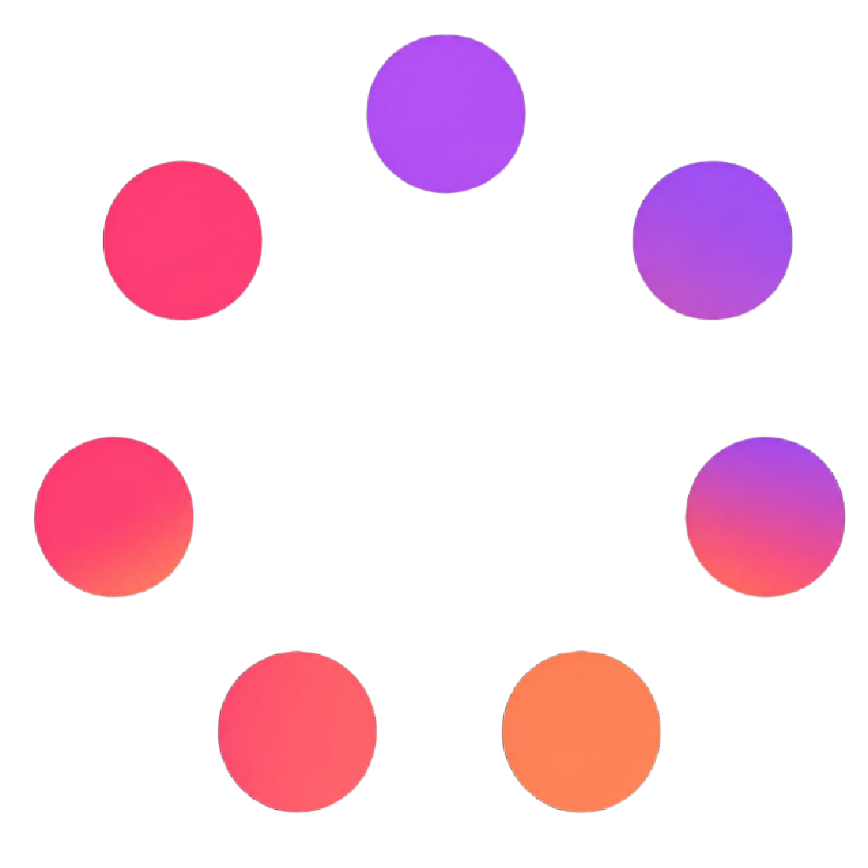
Bloom
Playful, energetic, product-led.

Forest
Calm, focused, long-term craft.
Sizing & clear space
Clear space
1× ring on every side.
Reserve at least one ring diameter of empty space around the mark. Nothing — type, edges, other marks — may enter this zone.
Minimum size
32px screen · 12mm print.
Below 32px the seven rings stop reading. Switch to the single-circle monogram instead.
24px40px64px96pxOptical alignment
Align to the ring center.
The mark's optical center is the ring's center — not the bounding box. Align type baselines to the ring, not to the asset frame.
Clatter/UIApproved backgrounds
Quiet canvases only. The mark relies on saturation contrast; busy backgrounds break it.
Pure white
#FFFFFF
Default. All marks.
Bone
#FAF8F3
Warm canvas. All marks.
Cool 50
#F1F5F9
Product surfaces. All marks.
Ink
#0A0A0A
Forest mark only.
Misuse
These transformations break the system. If a use case can't work without them, the use case needs to change — not the mark.
Don't rotate
Don't stretch
Don't recolor
Don't add shadow
No busy backgrounds
Don't invert
Don't crop
Don't blur
Co-branding
Lockup
Clatter on the left, partner on the right.
Partner- · Equal optical size between the two marks.
- · 1.5× clear space between marks, separated by a 1px hairline.
- · Clatter sits on the left, partner on the right.
- · Match the partner's grayscale treatment if they have one.
Endorsement
"Built with Clatter".
Clatter/UI- · Always include the wordmark when used as an endorsement.
- · Use the Bloom mark for community / open source contexts.
- · Use the Forest mark for enterprise / platform contexts.
Lockup builder
Generate & download a co-branding lockup.
Pick a Clatter mark, type the partner name, or upload the partner logo as PNG/SVG. Export the approved lockup as SVG (vector) or PNG @2x (raster).
Name is used when no logo is uploaded.
Output: 1200×400 · white canvas · Inter 600
Voice & tone
We are
- · Direct
- · Curious
- · Calm
- · Specific
We are not
- · Hype-y
- · Cute
- · Salesy
- · Vague
Tagline
"Design is the plan. Shipping is the proof."
Use the tagline as a closing line in keynote slides, in the README of a partner integration, or as alt text for the hero illustration. Never as a button label.
File formats
| Format | Use | Min size | Background |
|---|---|---|---|
| SVG | Web, product, anything vector. | 32px | Any approved canvas. |
| PNG @1x / @2x | Slides, docs, raster web. | 64px | White, bone, cool 50. |
| JPEG | Press kits, partner sites. | 128px | White only. |
| Print, signage, decks. | 12mm | White or bone. |
The downloadable Brand Kit ships all three marks plus the written usage guide.
Do / Don't
Do
- Use one mark per surface, never two at once.
- Pull accent colors only from that mark's palette.
- Float glass panels over a near-white canvas.
- Let typography do the work before color does.
- Pair the mark with 1× ring of clear space.
Don't
- Recolor the rings or reorder their circles.
- Combine palettes from two different marks.
- Add drop shadows under the mark.
- Place marks on photography or busy gradients.
- Rotate, stretch, crop, or outline the mark.
Ready to ship?
Download the kit and follow the rules above.