The Clatter Design & Brand Kit.
A near-monochrome design system for Clatter Apps — three sibling marks, three palettes, one quiet operator-grade system. Sora display, Inter body, Geist Mono for tokens. Every rule, written down once.
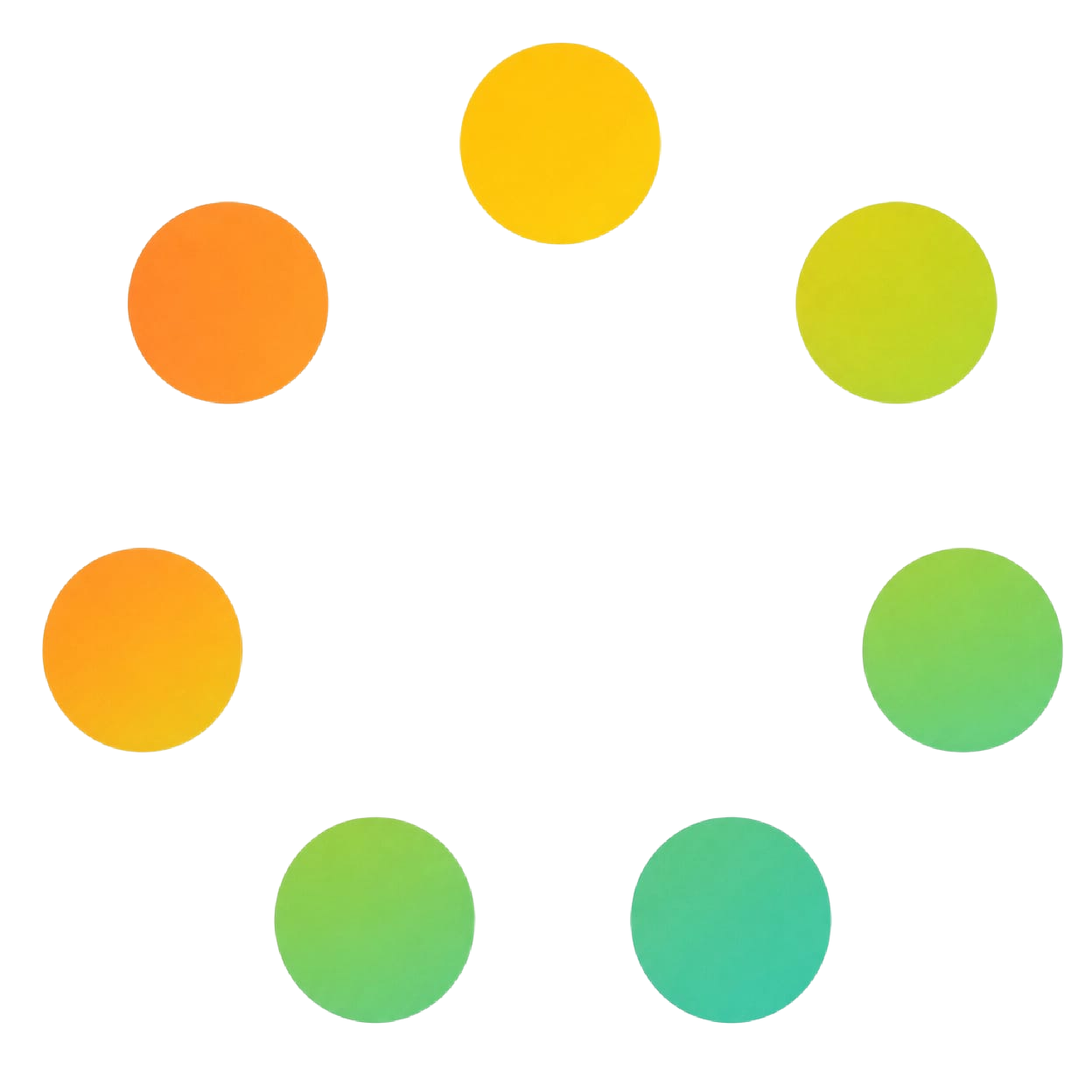
Clatter/UI
Sunrise edition
Warmth, momentum, daylight shipping.
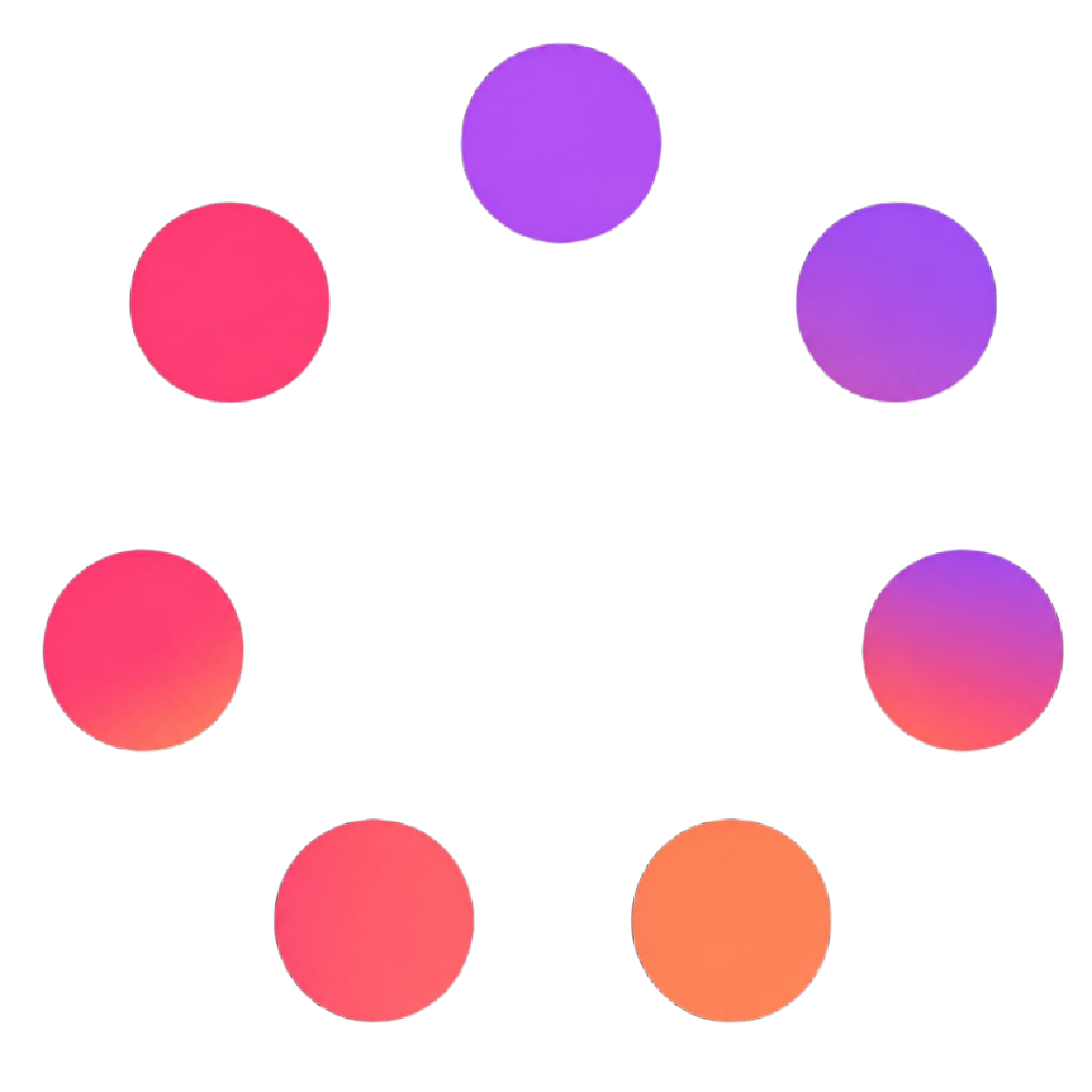
Clatter/UI
Bloom edition
Playful, energetic, product-led.
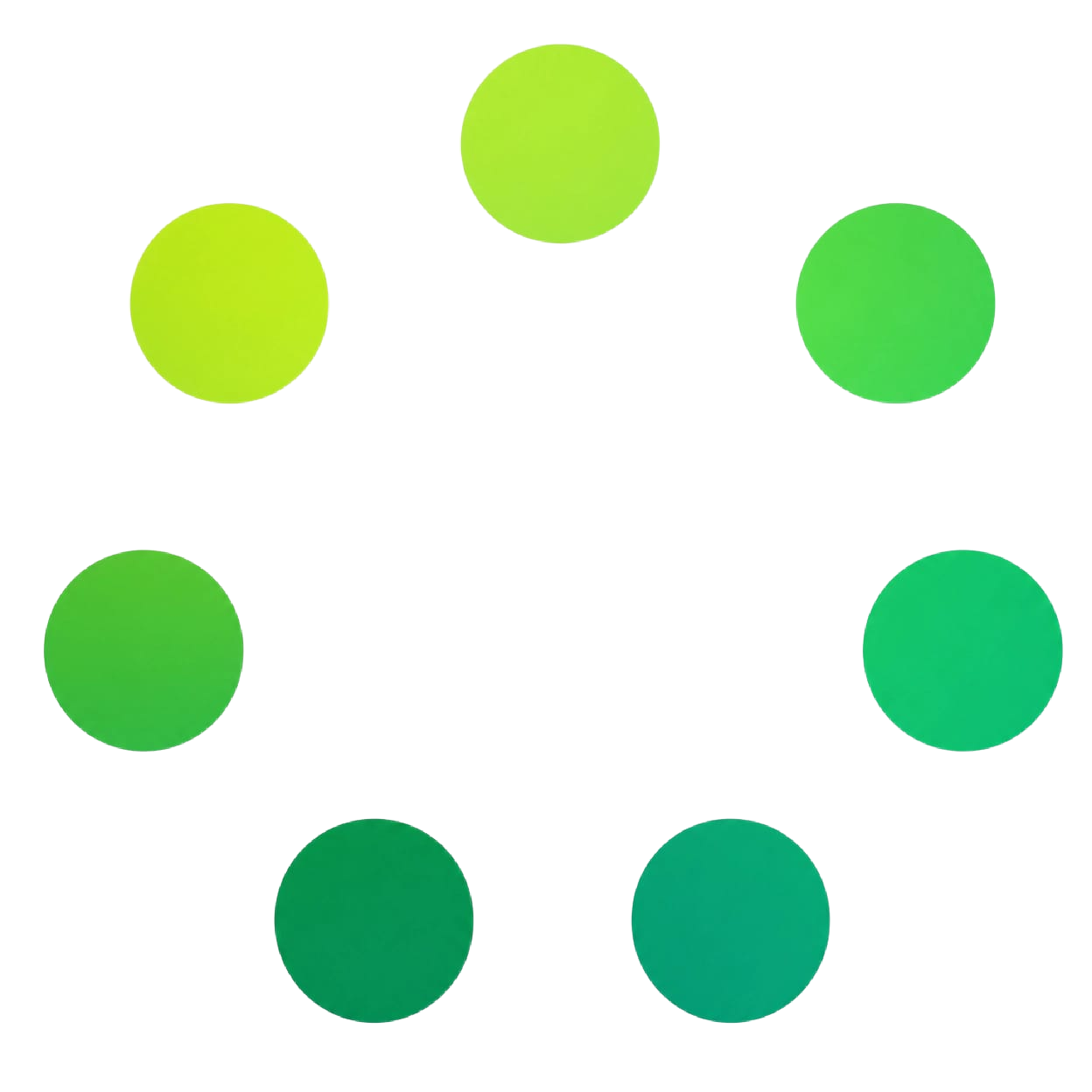
Clatter/UI
Forest edition
Calm, focused, long-term craft.
01 — Primitives
Composable by design.
The Shipping Design Plan treats the interface as a set of primitives — surfaces, type, tokens — that compose into any product. One canvas, one type family, one quiet vocabulary.
Primitive
Geometry
Every mark is built from seven equal circles arranged on a single ring. The geometry never changes — only the palette walks the ring.
Primitive
Three marks
Sunrise, Bloom, Forest. Siblings, never variants. One mark per surface, never two at once.
Primitive
Achromatic chrome
UI chrome is achromatic. Color appears only inside artwork — never on buttons, borders, focus rings, or backgrounds.
Primitive
Type-first
Sora display, Inter body, Geist Mono for tokens and code. Color is reserved for identity — never decoration.
02 — The Marks
Three logos. One geometry.
Each mark is a sibling, not a variant. They share construction but carry a different tone. Pick one per surface and let its palette do the rest.
Sunrise
MarkWarmth, momentum, daylight shipping.
For marketing, launches, onboarding — surfaces that should feel like a new beginning. Pairs best with cream and bone backgrounds.
Bloom
MarkPlayful, energetic, product-led.
For consumer features, social campaigns, community surfaces. Avoid on dense data interfaces — too active for tables.
Forest
MarkCalm, focused, long-term craft.
For enterprise, documentation, dashboards — surfaces that need trust. The default palette for the developer platform.
Construction
Seven circles, equal diameter, equal angular spacing on a single ring.
Clear space
Always leave 1× ring diameter of empty space around the mark.
Minimum size
32px on screen, 12mm in print. Below: switch to monogram.
Background
White, bone, or a cool 50 canvas. Never on photography or busy gradients.
03 — Color
Extracted from every mark.
Each palette is sampled directly from its mark, then walked around the ring as a named gradient. Open the dedicated palette page for the full token list.
Palette
Sunrise
7 tokens · Primary / Action / Highlight / Support / Deep
Palette
Bloom
7 tokens · Primary / Action / Highlight / Support / Deep
Palette
Forest
7 tokens · Primary / Action / Highlight / Support / Deep
04 — Typography
Sora · Inter · Geist Mono.
Sora carries every display and heading — geometric grotesque, light for editorial, semibold for structure. Inter carries body and UI. Geist Mono is reserved for tokens and code.
Display · Sora 300
Ship the plan.
Body · Inter 400 / 500
Clatter Apps designs calm, fast tools. Inter carries the weight of every paragraph, label, and button across the product surface.
Mono · Geist Mono
const ship = (plan) => plan.execute();
Reserved for tokens, code, version chips, and any label that speaks as system. Never used for body copy.
05 — Get the kit
Everything in one file.
The downloadable Brand Kit contains all three marks and every palette, plus the written usage guide. One file, ready for partners, designers, and press.
Clatter Brand Kit v1.0
3 logos · 3 palettes · usage guide · ~0.3 MB